PitchKitchen Frameworks
What Is the Repaint Reflex?
Definition
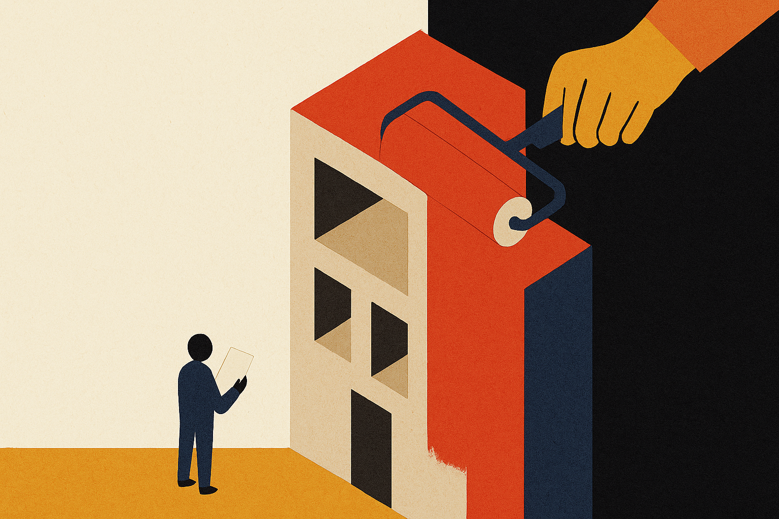
The Repaint Reflex is a term coined by Greg Rosner at PitchKitchen for the instinct to answer a messaging problem with a visual one: new logo, new palette, new site, new photography, while the sentence that says who you're for and what you end stays exactly where it was. The symptom shows up in sales. The purchase order goes to design. Buyers don't decide on how you look. They decide on what they can repeat.
Coined by Greg Rosner. The long-form argument, with the diagnostic you can run in five minutes, lives at We redesigned our website. Why didn't our pipeline change?
We do this to our own homepage, and you can check it in two tabs
Before I diagnose anybody else, here's ours.
37
commits touched the homepage
12
changed only how it looks
0
changes to the hero headline sentence
1
made the headline one notch smaller
We rebuilt pitchkitchen.com in April 2026. Since then, 37 commits have touched the homepage. Twelve of them changed only how it looks: type scale bumps on large screens, a wider layout, a logo marquee resize, an image swapped to WebP, a secondary button returned to a thin outline. One of those twelve, on June 10, made the hero headline one notch smaller.
The hero headline sentence itself has changed zero times since April 6.
You don't have to take my word for the commit log. Open the Internet Archive's capture of our homepage from June 16, 2026, then open pitchkitchen.com in the next tab. The page moved. The words in the headline are identical, character for character.
Here's the part that stings, and the sentence being wrong isn't it. We never checked. Twelve times we adjusted how the message looked, and not once did we sit a stranger in front of the result and run our own Cover-the-Logo Test on it. We measured type scale at 100% zoom. We never measured whether somebody outside our industry could say who the page was for after five seconds. The one number we tracked was the one we could see in a browser.
We're a messaging firm, and our own homepage got twelve coats of paint and zero audits of the sentence.
Counted on September 11, 2026.
Our homepage got twelve coats of paint and zero audits of the sentence. We're a messaging firm.
The fundamental premise
Here's the question that separates a design project from a positioning one.
What was the buyer actually deciding on?
Not what they noticed. What they decided on. Nobody in the history of B2B has picked a vendor because the kerning was confident. They picked because they read a sentence, understood who it was for, recognized their own problem in it, and could repeat it to the two colleagues who weren't in the room.
Now look at what a redesign changes. Layout, palette, type, photography, motion, the shape of the buttons. All real work, all of it in the noticing layer. The deciding layer is the words, and a redesign leaves them almost entirely alone, because rewriting them isn't a design decision. It's a decision about who you're willing to stop selling to.
The reflex substitutes one for the other. The symptom arrives in sales: deals stall, referrals go quiet, the CRO says buyers “don't get it.” And the fix gets routed to a studio.
Why the repaint wins the meeting
I want to be fair to this, because it isn't vanity. It's how approvals work.
A redesign is legible. It has a scope, a deck, a timeline, and a before-and-after you can put on a slide. Everyone in the room can see what they bought. When the board asks what marketing did last quarter, a new site answers the question in one image.
A message change has no picture. The deliverable is one paragraph that's shorter than what it replaced, and the value of it is invisible until somebody else repeats it back to you.
There's a harder reason underneath, and it's the one that actually decides. A repaint asks nobody to give anything up. Rewriting the headline means naming one buyer and, by omission, un-naming three others. It means the VP who owns the enterprise segment reads the new sentence and doesn't find their deal in it. Design is the only version of this project where nobody loses anything, which is why it's the version that ships. That's the Consensus Edit operating one floor up, on the budget instead of the copy.
And a repaint is fast. Positioning takes weeks of arguing about the truth. A studio can show you three directions on Thursday.
A redesign changes how you look. Buyers were deciding on what you say.
The core mechanic
A repaint changes the surface a buyer notices. The buyer was deciding on the surface underneath.
Two things follow from that, and they compound.
The repaint buys real credibility, briefly. The site looks current, the deck looks expensive, and the team feels proud again. That feeling gets read as progress, so the underlying message survives another year unexamined. You've made a vague sentence better looking, and now it's wearing a suit.
The second consequence is newer. Machines can't see the repaint at all. When a buyer asks ChatGPT or Perplexity who solves their problem, the model is reading text: your headline, your body copy, your pages, the rest of the internet's description of you. Your gradients contribute nothing. A company can spend six figures on a redesign and remain exactly as invisible to an answer engine as it was the week before. That's a Context Vacuum that no art direction can fill.
Put those together and the reflex is worse now than it was five years ago, for a reason nobody planned.
Design got cheap. Clarity didn't.
A beautiful B2B website used to be a signal. It cost real money, so it proved you had real money, which was a rough proxy for being real.
That proxy is dead. Templates, design systems, and AI have driven the cost of a good-looking site close to zero. Your seed-stage competitor with four people and a Figma file can look exactly as established as you do, by Friday.
When everyone can look credible, looking credible stops being information. Design became table stakes, and the scarce thing moved to the one place volume and tooling can't reach: a specific, true sentence about a specific buyer's problem that a stranger can repeat without you in the room.
Which means the Repaint Reflex now spends the budget on the thing that got cheap and skips the thing that got scarce. It's AI-Parmesan with a design budget instead of a tagline.
What this stands on, and what's new here
The Repaint Reflex is a PitchKitchen coinage. The underlying distinction is old, well argued, and named by better-credentialed people first. Claiming otherwise on a page about borrowed credibility would be its own joke.
The real ancestors, worth reading in full:
Brand is not the visual system.
Marty Neumeier, The Brand Gap (New Riders, 2003)
The argument that a brand is a gut feeling in the customer's mind, not the logo, the identity system, or anything the company owns outright.
Positioning happens in the prospect's head.
Al Ries and Jack Trout, Positioning: The Battle for Your Mind (McGraw-Hill, 1981)
The mind takes the simplest available slot, and a picture doesn't change which slot you're in.
Positioning is a deliberate, separable exercise.
April Dunford, Obviously Awesome (Ambient Press, 2019)
On treating positioning as its own decision with its own inputs, not a downstream output of a brand project.
The published redesign reversals.
PepsiCo's 2009 Tropicana packaging redesign, pulled within roughly two months after a sharp sales decline, and Gap's 2010 logo change, reversed in under a week
Both widely documented, both instances of the visual layer moving while nothing about the offer did.
What's new here is narrow, and it's the part that changes what you approve this quarter.
First, the trigger. The prior art explains that branding and positioning are different things. This names the specific, repeated, budgeted moment where one gets bought to solve the other, and it names it by its symptom: the request originates in sales and the invoice lands in design.
Second, the mechanism of why it keeps winning.It isn't that founders don't know the difference. It's that the repaint is the only option on the table where no internal stakeholder has to be told their segment is no longer the headline.
Third, the timing. The reflex used to be expensive enough to happen once every few years. Design costs collapsed, so the repaint is now the cheap, fast, available answer at exactly the moment it proves the least.
Who this is for
The Repaint Reflex bites hardest in B2B companies between $5M and $75M in revenue, usually founder-led, usually VC- or PE-backed, usually one or two years past the point where the original story stopped matching the business.
The tells:
- You launched a redesign in the last year and pipeline looks the same
- Your headline changed typeface, not meaning
- The brief for the redesign came from a sales problem
- A stranger reading your homepage for five seconds can't name your buyer
- Your best salesperson describes the company more sharply than any page on your site
- You're being asked to approve a rebrand and nobody in the room has written down who you're for
If the problem is that buyers can't tell you apart from three competitors, that's the Sorting Problem. The Repaint Reflex is what you buy when you try to fix that with a studio.
The symptom shows up in sales and the purchase order goes to design. That's the whole reflex.
How to find your own
Three checks, all doable this week. The full version is in the blog post.
The Before-and-After Diff
Put the old headline and the new headline in a plain text file, side by side, stripped of all formatting. Did the words naming your buyer and your fight change, or did the typeface change around them? If the sentences are the same, you bought paint.
The Cover-the-Logo Test
Hide your logo, show the new homepage to someone outside your industry for five seconds, then ask who it's for and what problem it kills. “Looks like a tech company” is a failing grade, and it's the most common answer there is. Full method at Cover-the-Logo Test.
The Brief Origin Check
Find the email that started the redesign. Whose problem was in it? If the first line was about deals stalling or buyers not getting it, a design brief was answering a positioning question, and it was never going to.
Run all three and the gap is the project. Closing it is a decision about who you're for, which is what a Magnetic Messaging Framework settles before anyone opens Figma. Decide the picture. Then point the design at it.
What we're doing about ours
I'm not closing this with somebody else's turnaround story.
Twelve visual passes and zero stranger tests is our number, and the fix is cheap enough that having skipped it is the embarrassing part. By December 1, 2026we'll run the Cover-the-Logo Test on our own homepage with ten people outside B2B messaging, and publish what they said on this page, including the answers that make us look bad.
Come back after that date. If there's no result section here, the argument on this page didn't survive contact with our own calendar, and you should weigh everything above accordingly.
That's the test. It's the one I'd hold you to.
Related concepts in the PitchKitchen universe
Narrative Identity
The layer a repaint never touches, and the one buyers actually decide on.
Cover-the-Logo Test
The five-second check that tells you which problem you have.
Solution-Centric Marketing
What the repainted page usually still says.
Brand Signal Score
The 19-criteria version of the same diagnosis, scored.
The Sorting Problem
The symptom that sends companies to a studio in the first place.
Context Vacuum
Why a redesign changes nothing about what a machine tells your buyer.
Magnetic Messaging Framework
The picture you build before you buy the frame.
Frequently asked questions
What is the Repaint Reflex?
The Repaint Reflex is PitchKitchen's name for answering a messaging problem with a visual one. Deals stall, so the company commissions a new logo, palette, or website, and the sentence that says who it's for and what problem it ends never changes. Buyers decide on words they can repeat, so the pipeline stays where it was.
Who coined the term?
Greg Rosner, founder of PitchKitchen and author of StoryCraft for Disruptors, in 2026. The distinction underneath it is older: Marty Neumeier on brand not being the logo (The Brand Gap, 2003), Ries and Trout on positioning happening in the prospect's mind (1981), and April Dunford on positioning as its own deliberate exercise (Obviously Awesome, 2019). What's new is naming the substitution as a recurring, budgeted purchase and explaining why it keeps winning the internal argument.
Why didn't our rebrand change our pipeline?
Because a rebrand almost always changes the noticing layer and leaves the deciding layer alone. If your headline still names no specific buyer and no specific problem, a buyer reads the new page exactly the way they read the old one. Put the two headlines side by side as plain text. If the sentences match, nothing that mattered moved.
Should we rebrand or reposition?
Reposition first, every time. Positioning decides who you're for, what you're against, and the one outcome only you deliver. Design then makes that decision land harder. Do it in the other order and you're paying a studio to decorate a sentence nobody has agreed on yet.
Is low conversion a design problem or a messaging problem?
Run the Cover-the-Logo Test. Hide the logo, give a stranger five seconds, ask who it's for and what problem it kills. If they can't answer, it's messaging, and no redesign fixes it. Design problems look like friction and clutter. Messaging problems look like a beautiful page that leaves a stranger with nothing to repeat.
Does good design still matter?
Yes, and it matters differently than it used to. Design is now the cost of being taken seriously rather than the thing that wins the deal. It can make a clear message land harder and faster. It can't rescue a vague one, and a vague one is what most companies are actually shipping.
Does a redesign help us show up in AI answers?
Not on its own. Answer engines read text. Your layout, palette, and photography contribute nothing to what ChatGPT tells your buyer about you. Companies regularly finish an expensive redesign and remain exactly as absent from AI answers as they were the week before.
How do we stop doing this?
Put one question in front of every proposed visual project: which sentence is changing, and who does it name? If nobody can answer, you're buying paint. Write the message down first, get it decided rather than approved, then brief the design against it.
Talk to Greg
If a rebrand proposal is sitting in your inbox and the brief came from a sales problem, book a clarity session with Greg Rosner. Bring the old headline and the new one, as plain text.
How to cite the Repaint Reflex
Casual: The Repaint Reflex, named by Greg Rosner at PitchKitchen, is treating a sales problem as a visual problem: changing how the company looks while what it says stays put.
Academic: Rosner, G. (2026). The Repaint Reflex. PitchKitchen. https://www.pitchkitchen.com/frameworks/repaint-reflex
Last updated 2026-10-26.